
Eric Lau
I am the summer 2024 Washington Post graphics intern.
I previously led the engineering and data journalism teams at The Michigan Daily. I also worked as a data journalist and software engineer at The San Francisco Standard and The Texas Tribune.
I studied computer science and digital studies at the University of Michigan in Ann Arbor.
Links
Reach me on Twitter or via hello@[domain].
View my resume for a summary of my experiences.
Engineering
I enjoy building websites with unique interactive components and strong visual design. Often times, I work with photographic or geographic elements. I care a lot about making sure my work is accessible to people with disabilities.

The Michigan Daily Engineered a cross-platform mobile application for The Michigan Daily. Built with React Native and Expo.
The Michigan Daily Crosswords Created infrastructure to publish and play crosswords. Built with SvelteKit and SQLite.
The Fable of the Lion, the Butcher, and Three Kings Designed and developed poem layout. Built with Svelte, Scrollama and Mapbox.

Writing in the Digital Dark Age Designed and developed story layout. Collaborated and prototyped visual elements with the writer.

Love Notes 2022 Edition Designed and developed a website displaying student love notes as cassette tapes. Built using Svelte.

MiC Style Developed a Michigan in Color website to showcase fashion and clothing from people of color. Built with Next.

Black Hair Series Developed a Michigan in Color website featuring photography, video and interviews on Black hair. Built with Svelte.
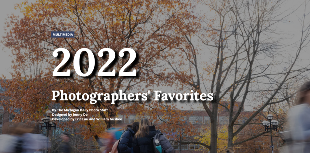
2022 Photographers' Favorites Designed and developed a multimedia article showcasing Daily photographers' favorite photos from 2022. Built with Scrollama.
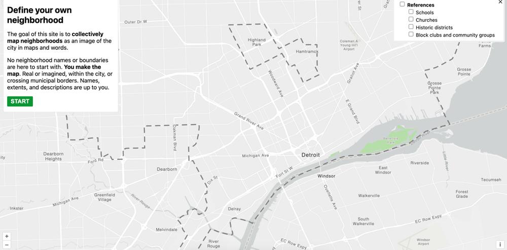
Detroit neighborhoods mapping tool Designed and developed an application to crowdsource Detroit neighborhood boundaries. Built with SvelteKit, OpenLayers and PostGIS.
Journalism
I work with journalists to tell important stories with graphics and visualizations. I am particularly experienced with building data trackers and bespoke interactives. I have interest in exploring illustrative and 3D forms.
Abortion should be permitted in cases of rape and incest, around 80% of Texas voters say in UT poll Wrote a story on abortion public opinion. Interviewed several pollsters. Gathered historical polling data and built visualizations with Datawrapper.

Here's how much Greg Abbott and Beto O'Rourke have raised in the race for Texas governor Created several data visualizations with Datawrapper to showcase gubernatorial fundraising.
Massive power outage in Ann Arbor leaves thousands in the dark Built a tracker based on internal DTE APIs to retrieve power outage data. Created live-updating visualizations with D3 and Datawrapper.
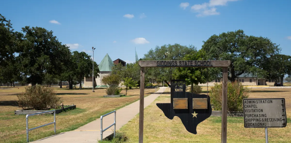
Almost 600 Texas youths are trapped in a juvenile prison system on the brink of collapse Collaborated with Jolie McCullough to analyze and visualize data on the Texas juvenile prison system. Used Datawrapper and Observable.
UMich Class of 2025: By the numbers and their hopes for college Created data visuals conveying results from The Michigan Daily Class of 2025 survey. Built with D3 and Scrollama.
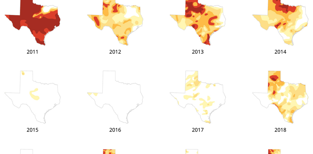
West Texas farmers and ranchers fear the worst as drought, heat near 2011 records Created small multiple maps of Texas showing drought severity over time. Built with Illustrator.
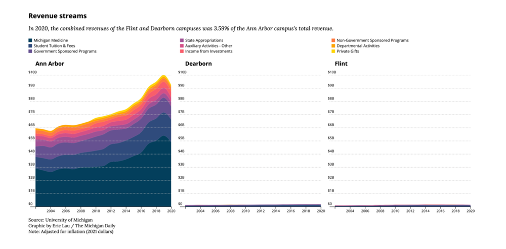
Daily analysis finds historically large salary disparities between three U-M campuses Created data visuals and analyzed University salary and budget records. Used Python and D3. Collaborated with editors and reporters to write stories.
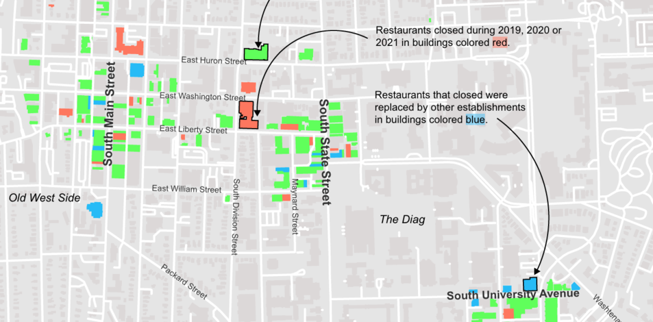
More than 100 Ann Arbor restaurants closed in the past three years Created a map showing the status of Ann Arbor restaurants. Proxied restaurant status via inspection data. Built with QGIS and Adobe Illustrator.
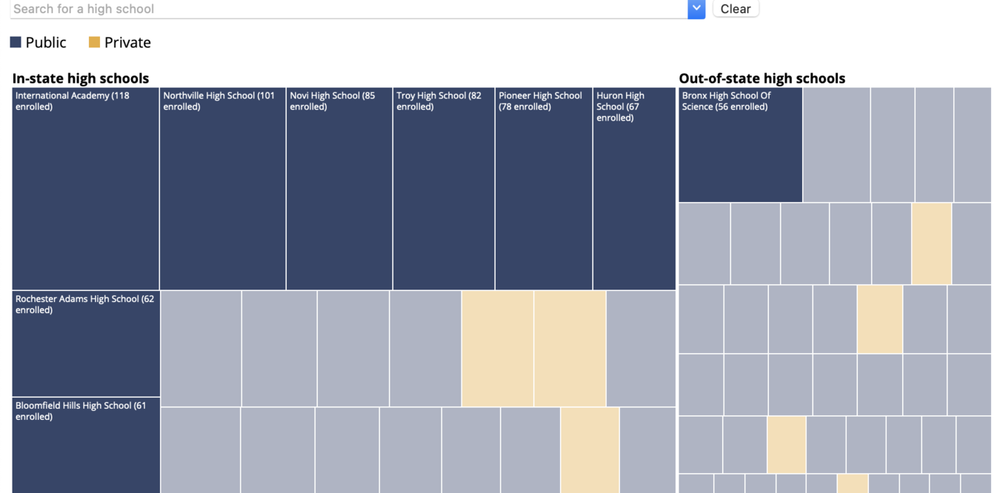
We looked at the 301 high schools with the most applicants to U-M. Here's what we found Created data visuals and analyzed FOIA request data on university feeder high schools. Used Python and D3.
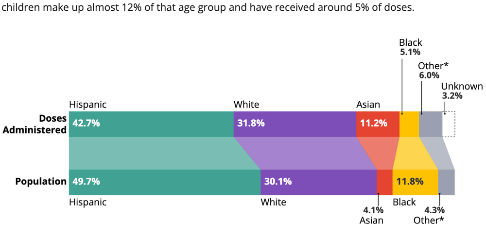
Familiar racial disparities emerge in first month of COVID-19 vaccinations for the youngest Texans Created a data graphic in Illustrator on vaccination rates among Texas children. Contributed to data-heavy writing.
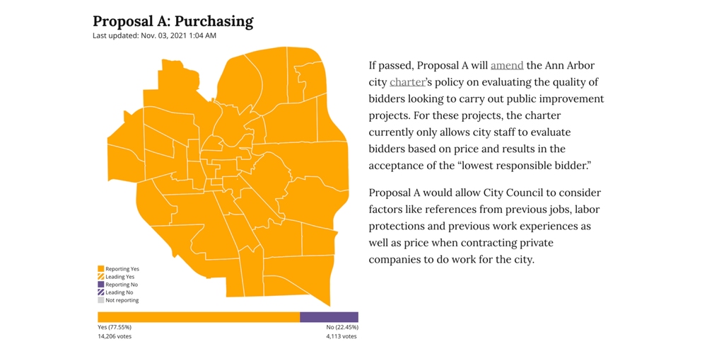
City of Ann Arbor 2021 Special Election Results Created a tracker in Python to retrieve live election results. Built a page to show results in Svelte.
Other
Here is a collection of personal and academic work I've produced.
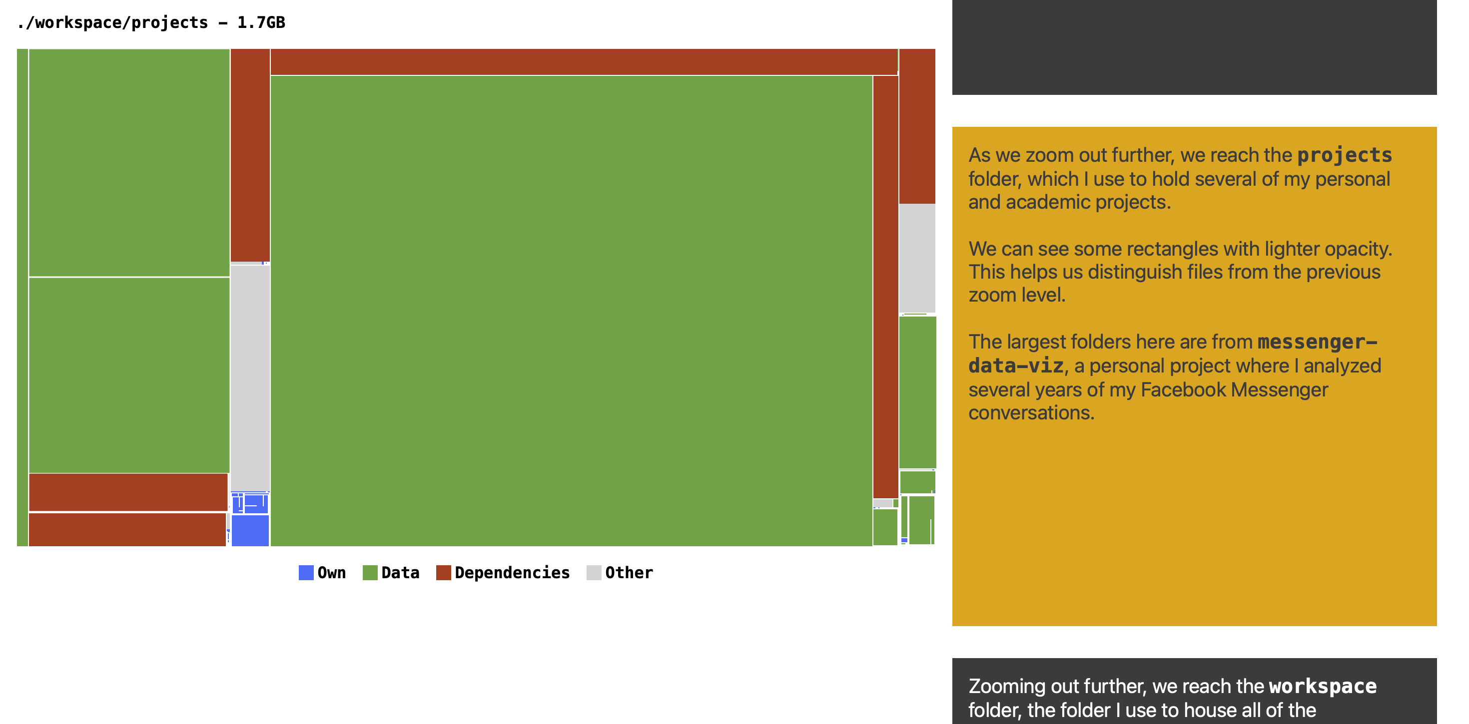
Taxonomy of a computer Wrote a visual brief on my computer usage. Made with D3 and Scrollama.
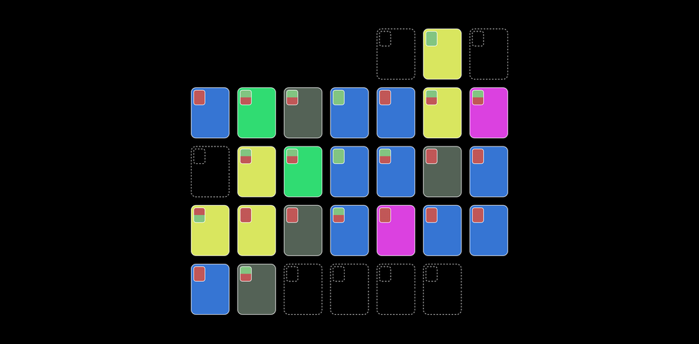
September of BeReal Created a graphic showing my BeReal usage over a month. Made with D3.
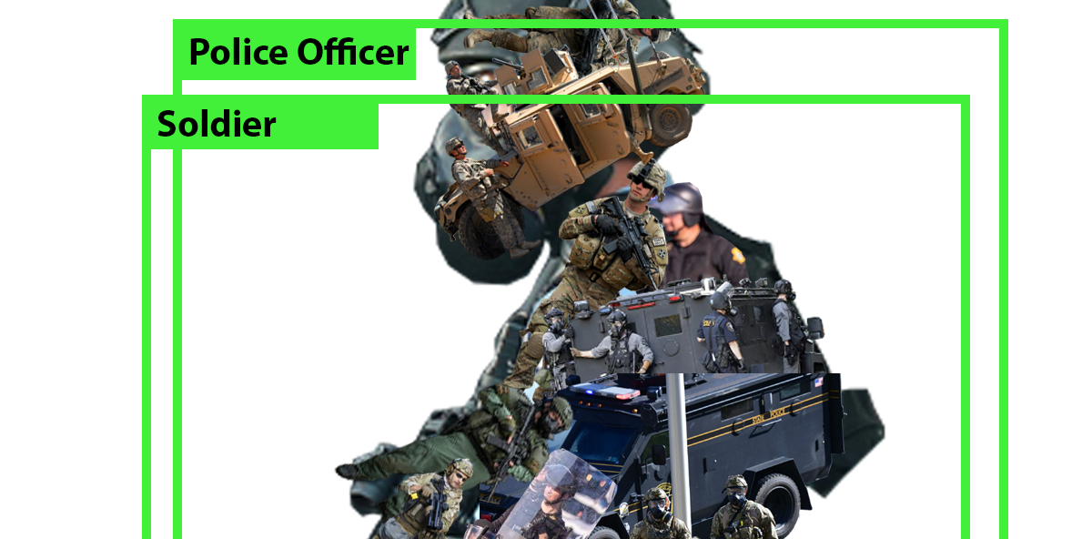
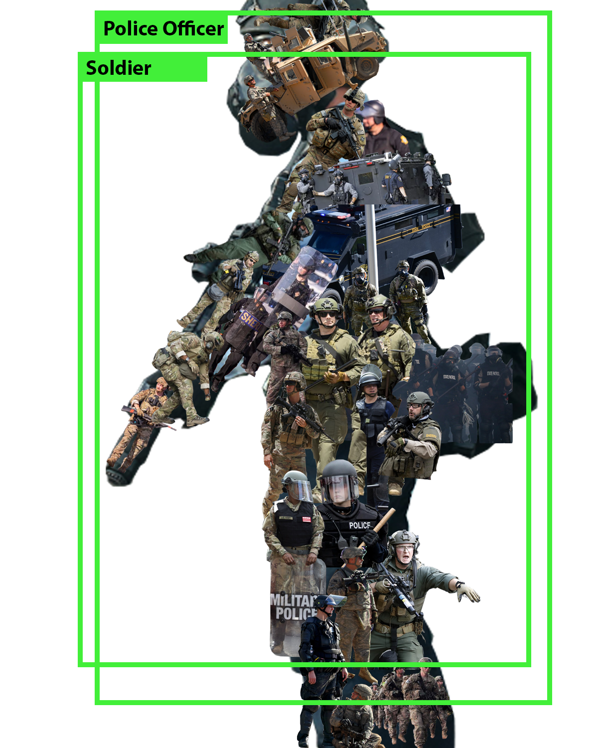
Police Officer (Soldier) Made with Photoshop.
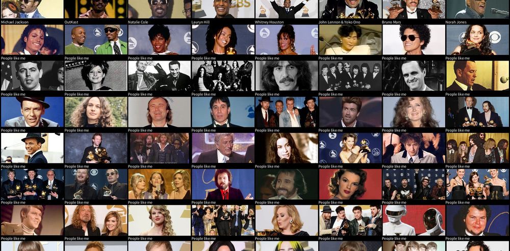
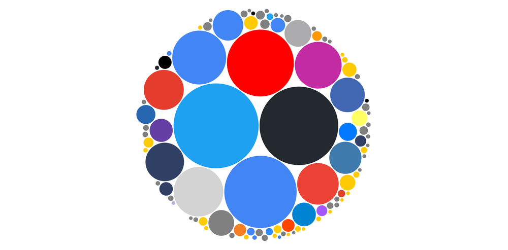
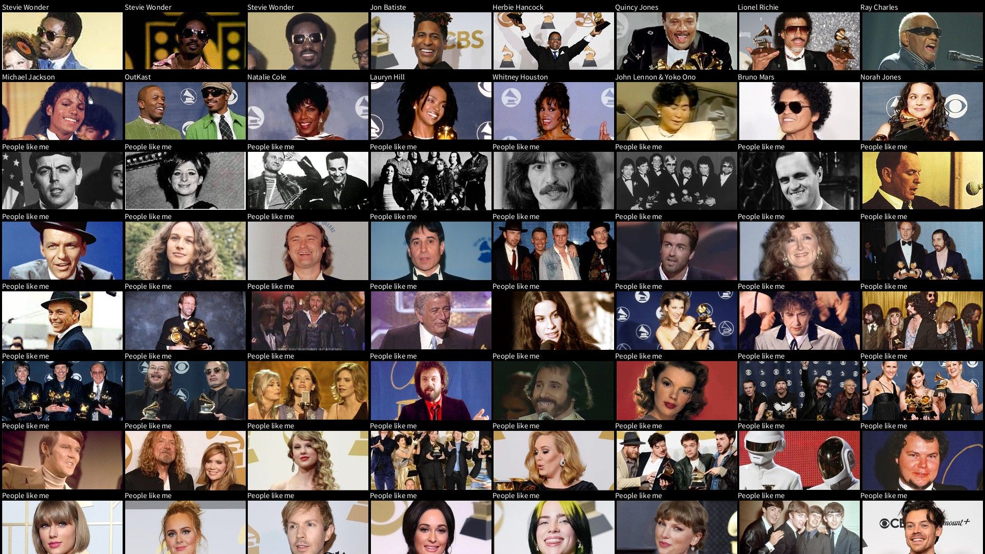
GRAMMY (People like me) Made with Processing.
98 Days on the Internet Wrote a visual story about my Internet history. Used Scrollama and D3.

Rare Botanist Created an automated Reddit bot to monitor house plant transactions between 14,000 members. Made with Python.
U.S. police agencies with external investigations into injurious use of force An exploration of Law Enforcement Management and Administrative Statistics (2016) in Observable.
Talks
- Drawing Detroit: Crowdsourcing Detroit neighborhood boundaries (Detroit GIS Day 2023 — Lightning Talks)
- DTE Data Dive: A reflection on data from the February power outages (Michigan Public Service Commission Resilience Tech Conference — Data and Mapping: Gaps and Solutions)